
Occitania
OAKLAND, CA
Taking inspiration from fine art, romantic poetry and themes of duality, Occitania’s visual identity is as artfully considered as its regional Southern French dishes.
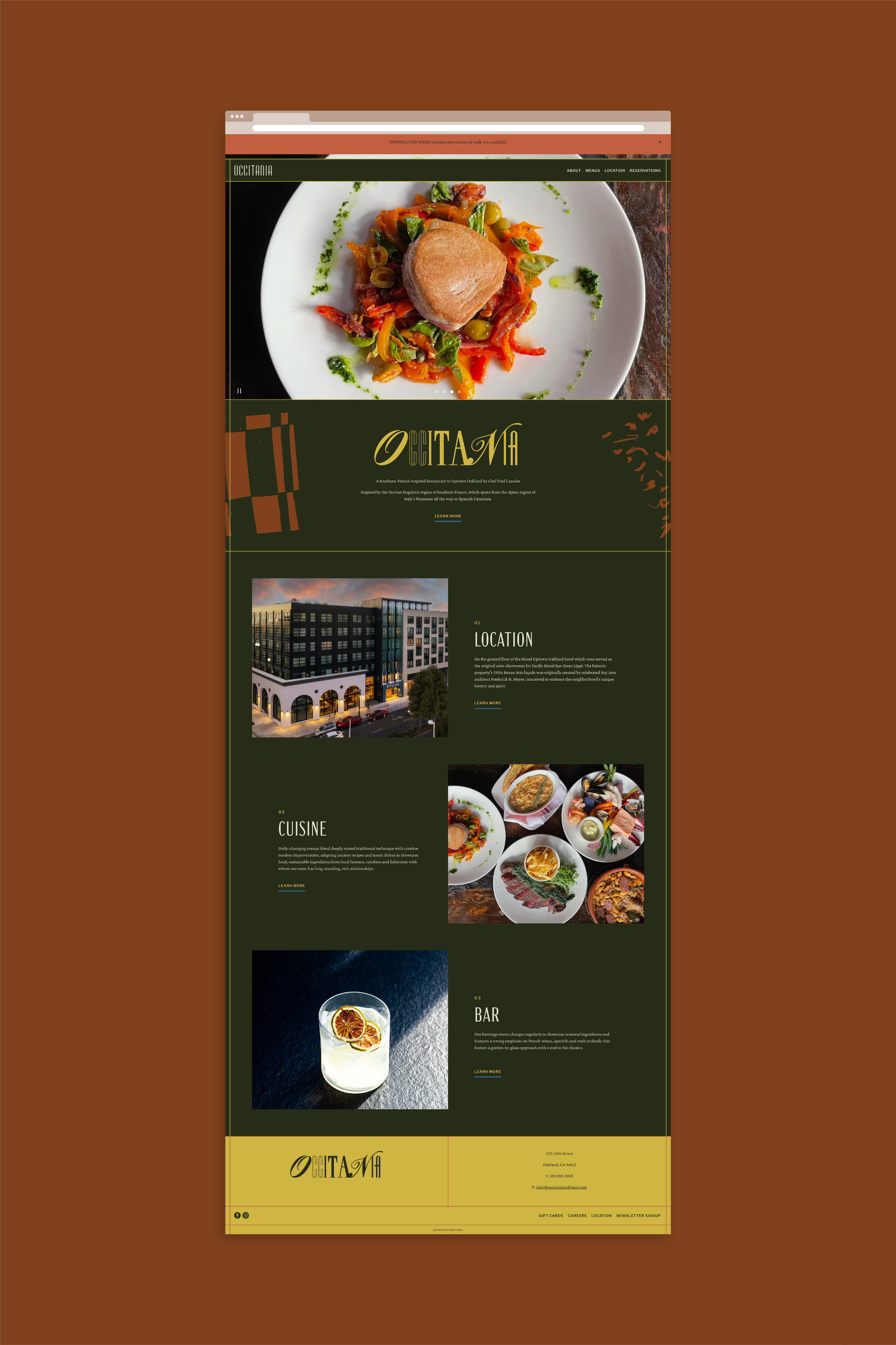
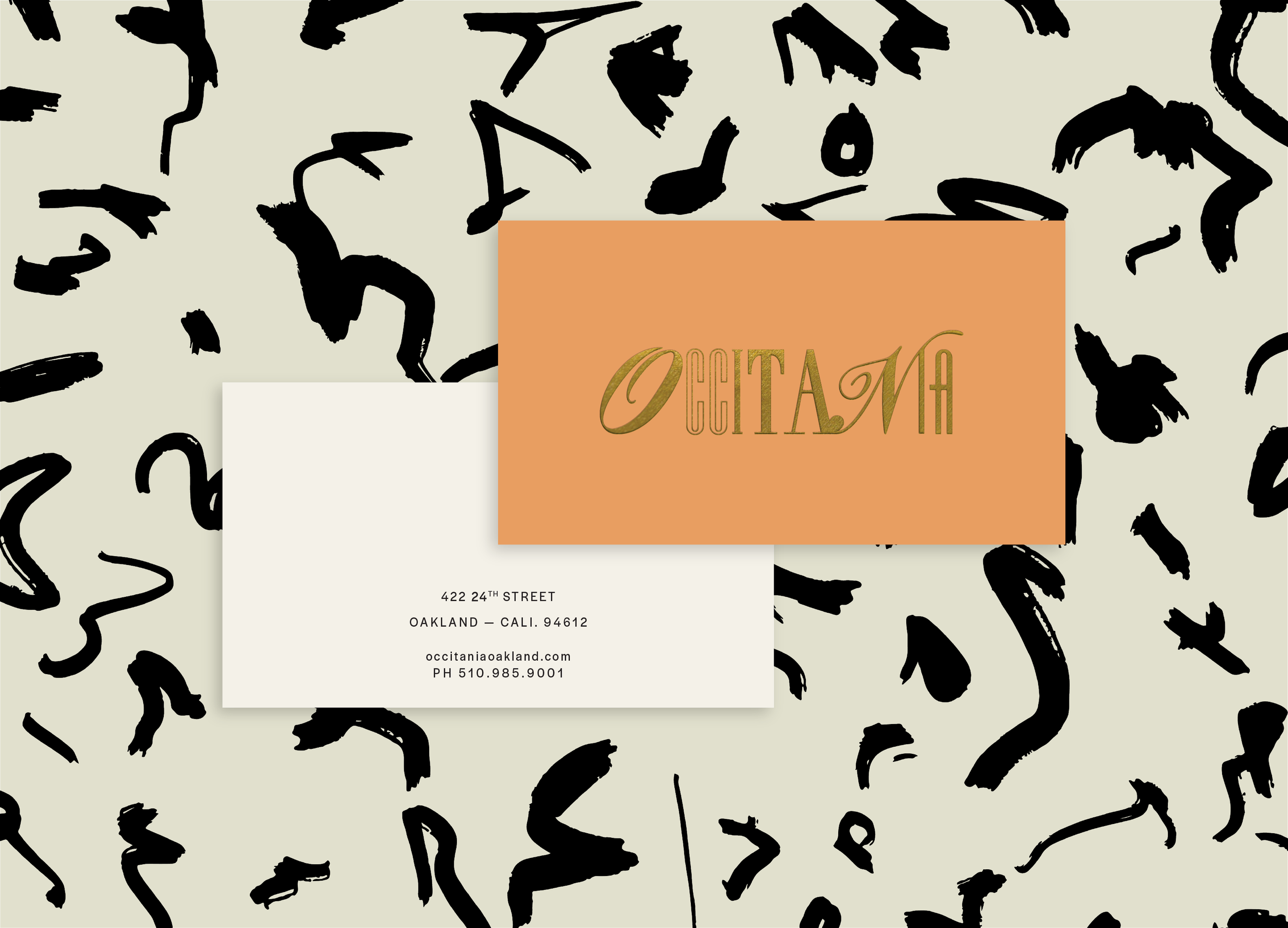
It’s rare to find a client who gives the designer carte blanche to bend and break traditional design rules in the interest of creating a unique and luxe dining experience from menu to check presenter. It’s also rare that the client comes equipped with a primary logo already created. Occitania brought both to create a welcome challenge. With upscale touchpoints ranging from bespoke bar menus for a robust wine list, to variable coasters, the resulting identity perfectly marries the pain and pleasure of the artist (or in this case, Chef Paul Canales) with the ethereal dining experience one finds at Occitania.
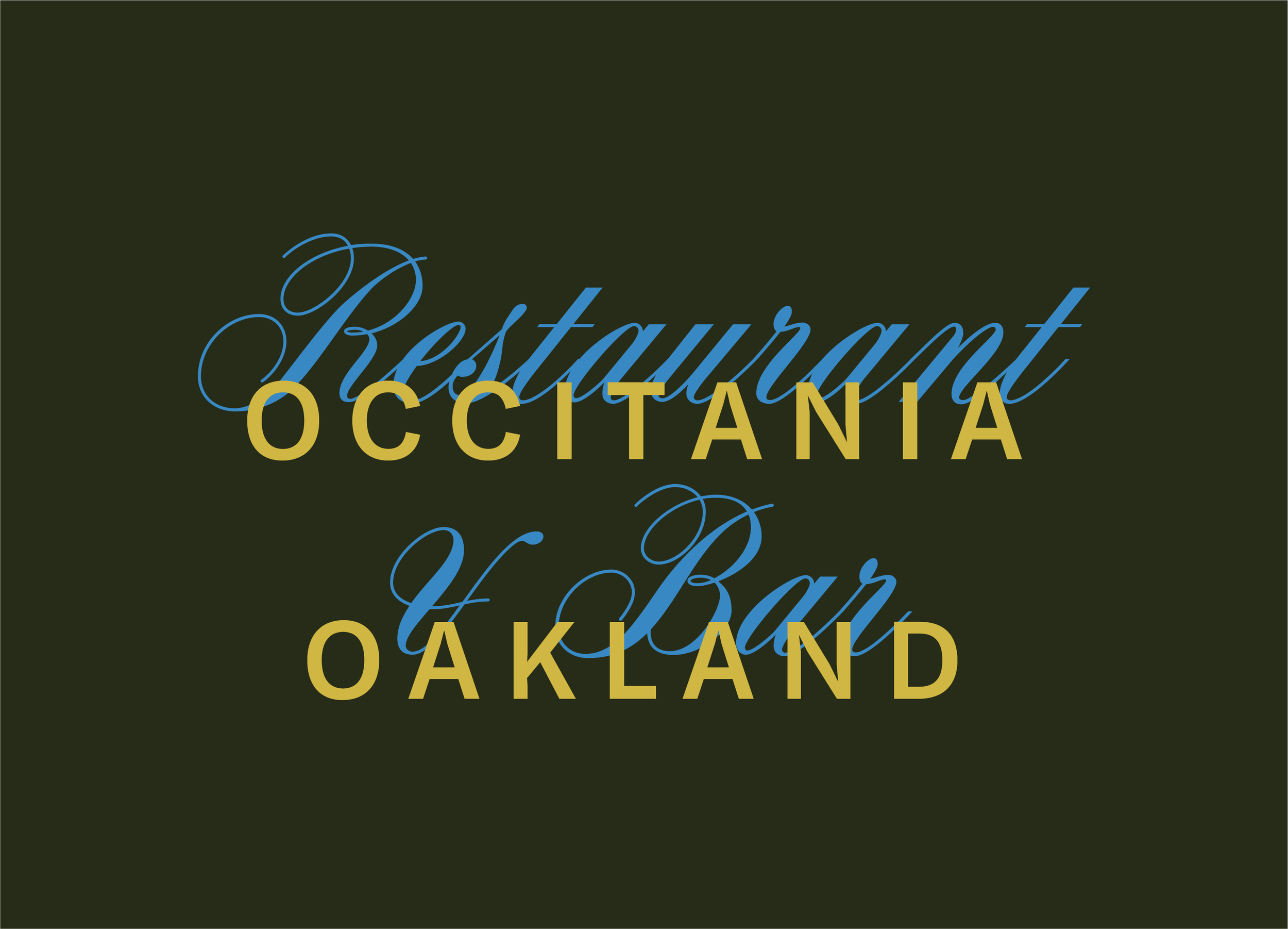
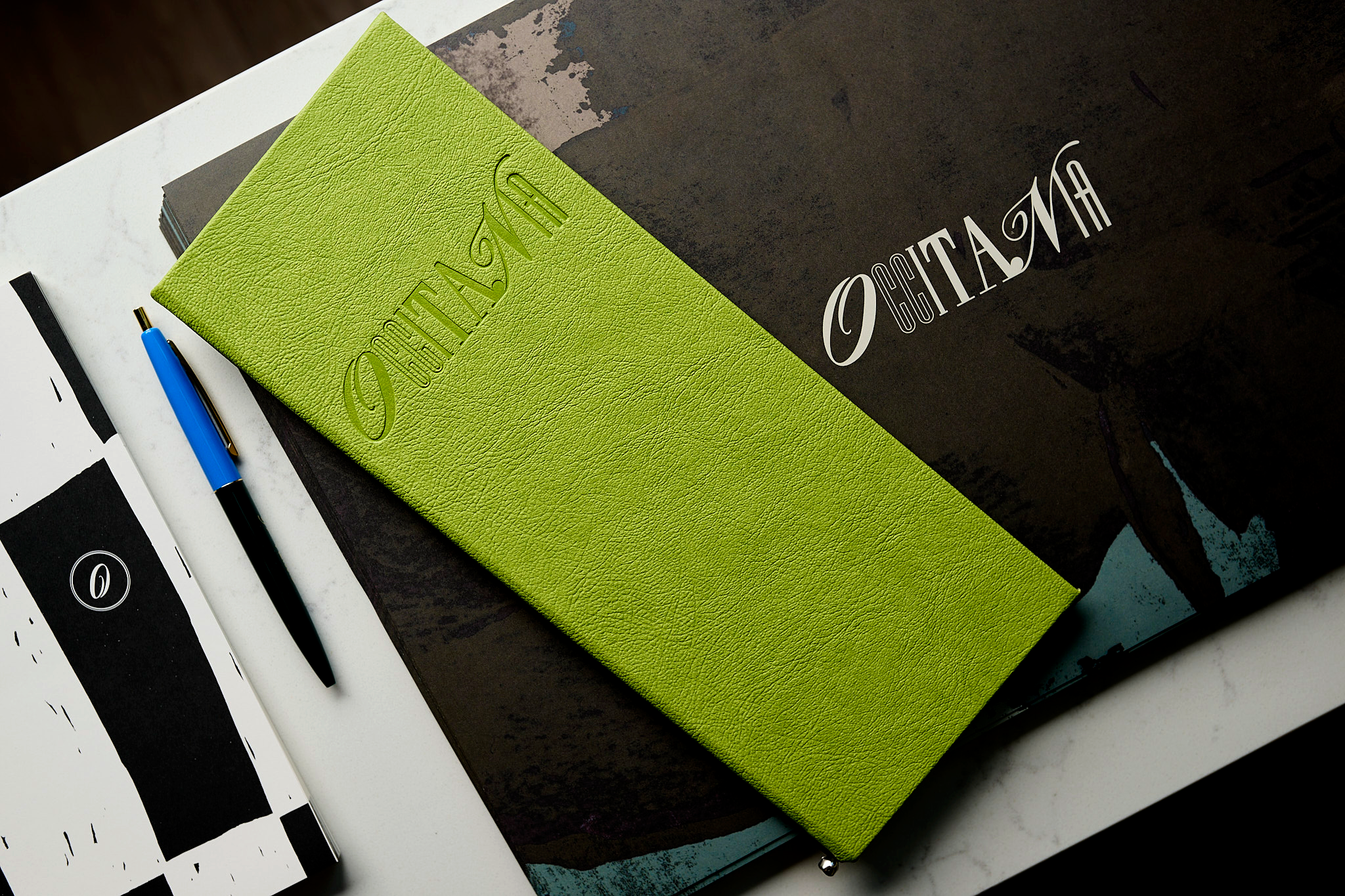
The original idea for the logo came to us in the form of a pencil sketch, which I painstakingly refined to ensure each letter felt equally balanced and thoughtfully engaged with the rest of the letterforms.
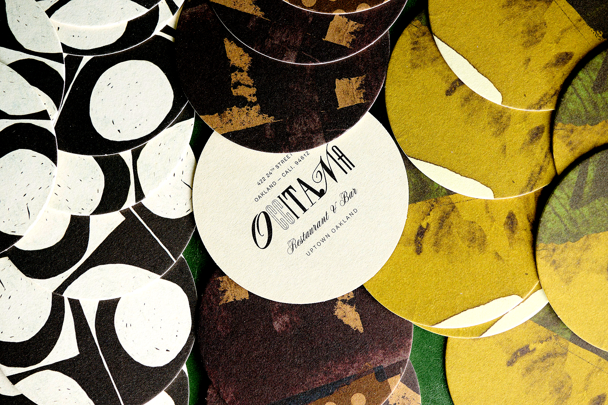
Three versions of coasters were created as a way to create a “surprise and delight” moment for guests, encouraging conversation among patrons and even some playful discussion around who was served the most aesthetically pleasing coaster.
*CLIENT OF CARBONATE
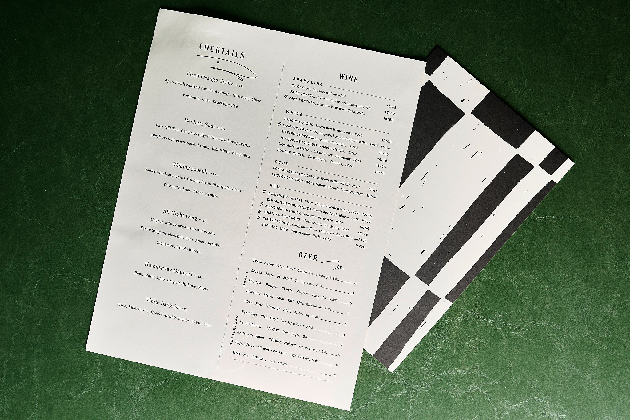
Since so much of the concept was inspired by romantic pursuits (poetry, music, painting, weaving), it felt appropriate that the menu take on a similar romantic layout. Dishes and ingredients cascade down the menu pages as though they are music notes on sheet music, further establishing Occitania as an artful experience in the guests’ minds.